Exploring the Best Python Libraries for Data Visualization
Introduction to essential data visualization libraries for data scientists. Find the best package to visualize your data.

Visualization is one of the essential tools in every data scientist's toolbox. Every data scientist should have access to varying types of plots and graphs.
We will go through some of the most popular visualization libraries for Python. Namely, we will have a look at
- Matplotlib
- Seaborn
- Plotly
- Bokeh
All of these are well-established open-source libraries under active development and lively community support.
Demonstration
We plot a scatter plot using all of the compared visualization libraries. The same data is used to test all the libraries. The data is generated using NumPy and stored in a Pandas data frame.
# Import Pandas and NumPy
import pandas as pd
import numpy as np

# Create a data frame with random 'x', 'y' and 'size' columns
df = pd.DataFrame(data={
    'x': 10*np.random.randn(100, ),
    'y': 10*np.random.randn(100, ),
    'size': 10*np.abs(np.random.randn(100, ))})
Matplotlib
Matplotlib is the defacto library for Python numerical visualization. It was first released in 2003 and has been under active development ever since.
Matlotlib is the replacement of Matlab plotting engine the same as NumPy is replacement of Matlab linear algebra engine.
Matplotlib provides support for all the basic plot types: line charts, bar charts, box diagrams, scatter plots, and pie charts. It is highly customizable and can produce publication-quality figures. Matplotlib is pretty much universally supported. You can use it with NumPy, Pandas, Jupyter, etc... It is safe to assume that you can rely on Matplotlib support for most cases.
matplotlib.pyplot provides a familiar interface for those who are accustomed to the Matlab plot interface. This way you can utilize similar functions to Matlab to visualize your data. Check the following cheat sheet to explore the features
One downside is that if you need to modify the look and feel down to the last detail, the notation can be quite verbose.
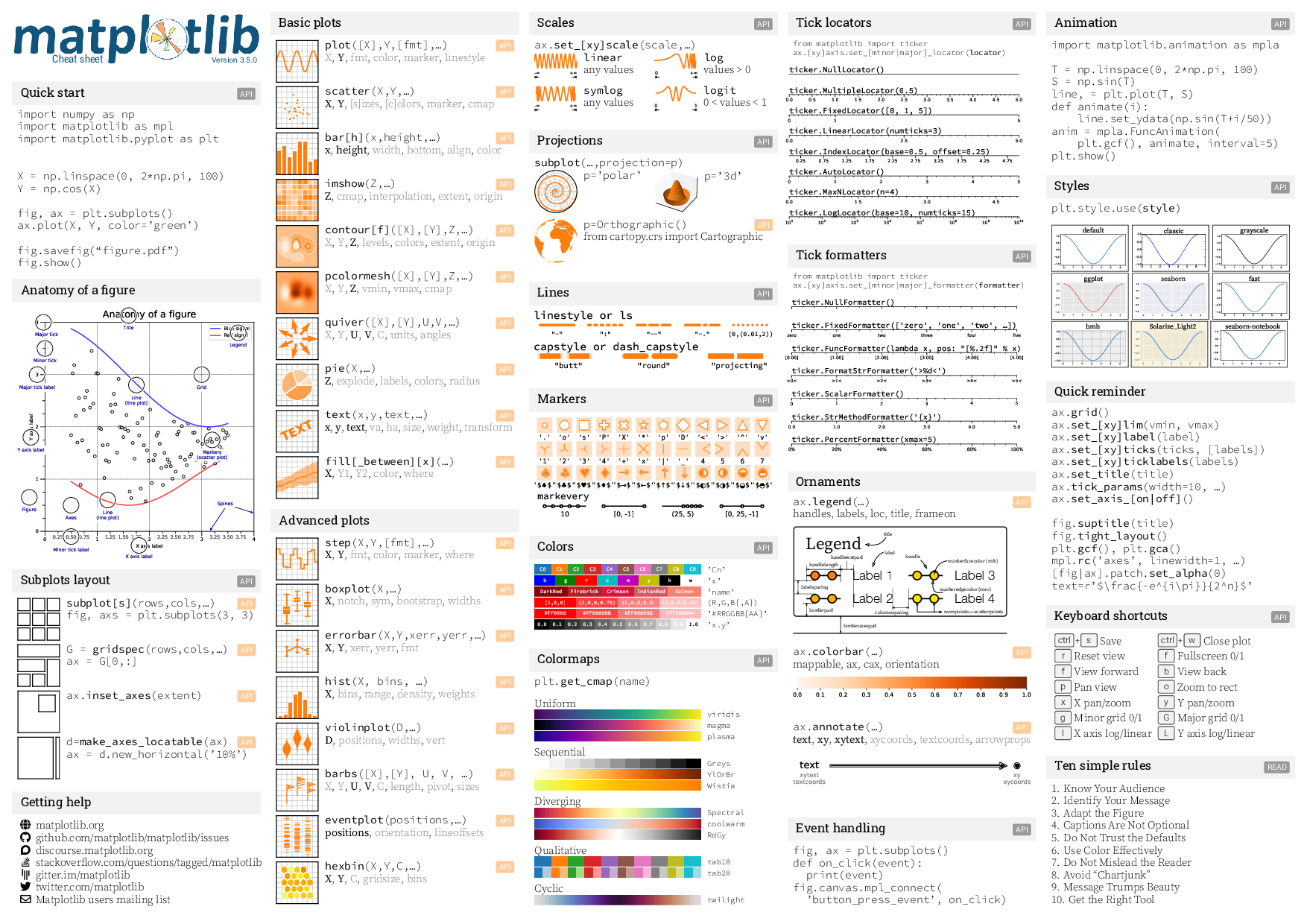
Matplotlib visualization example
import matplotlib.pyplot as plt

plt.scatter(df['x'], df['y'], s=df['size'])
plt.show()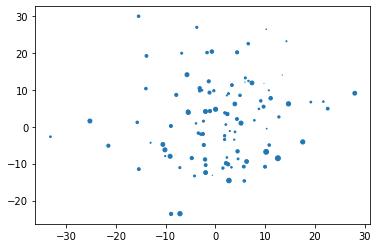
Seaborn
Seaborn is particularly focused on plotting statistical data. It is built on top of Matplotlib. So it shares most of the features provided by Matplotlib, such, as, great support from all the necessary tools for data scientists. Unsurprisingly, the statistics and data frame library Pandas has good support for Seaborn.
Seaborn is best suite for visualization statistical data. Thus, it is great accompanion for every data scientist.
One of the nice things about Seaborn is that it treats Pandas data frames as first-class citizens, and has direct support for them. This means that you don't usually have to extract the data from specific columns, but rather just pass the whole data frame to the plotting method.
Check the seaborn tutorials for a more hands-on feel on the Seaborn library.
Seaborn visualization example
import seaborn as sns

sns.scatterplot(data=df, x='x', y='y', size='size')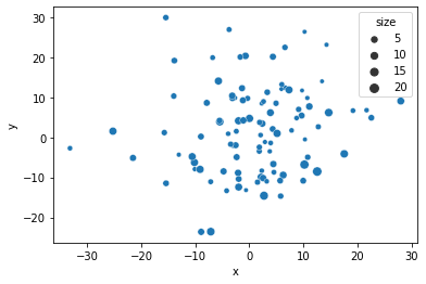
Plotly
Plotly is a language-agnostic visualization, which is great if you are working on your data in multiple languages, such as Python, JavaScript, Julia, Matlab and R. Then, you can use a common visualization library.
Plotly is developed by a company and, thus, it has built extensive support for enterprise applications.
Even though it is backed by a company it is still an open-source tool. If you are working in big companies like Nvidia or Tesla, you might see Plotly as the goto-tool in corporate data illustrations.
There are many good qualities of corporate-backed software: documentation tends to be up-to-date and you can get better support.
In Jupyter, Plotly provides interactive tools to explore the data. These can become surprisingly handy when you are not fully sure what is the best way to illustrate big data sets.
Check the Plotly fundamentals for further examples
Plotly visualization example
import plotly.express as px
fig = px.scatter(df, x='x', y='y', size='size')
fig.show()
Bokeh
Bokeh is more focused on interactive visualization. You can build functional data visualization with a graphical user interface to control varying parameters in your data.
Bokeh is steered towards functional visualization including interactive tools, dashboards, and streaming data sets.
If your work needs interaction or real-time data illustration, Bokeh is the tool for you.
Check the Bokeh demos site for interactive examples.
Bokeh visualization example
import bokeh

from bokeh.plotting import figure, output_file, show

bokeh.io.output_notebook()

p = figure(width=400, height=400)

# add a circle renderer with a size, color, and alpha
p.circle(df['x'], df['y'], size=df['size'], color="navy")

show(p)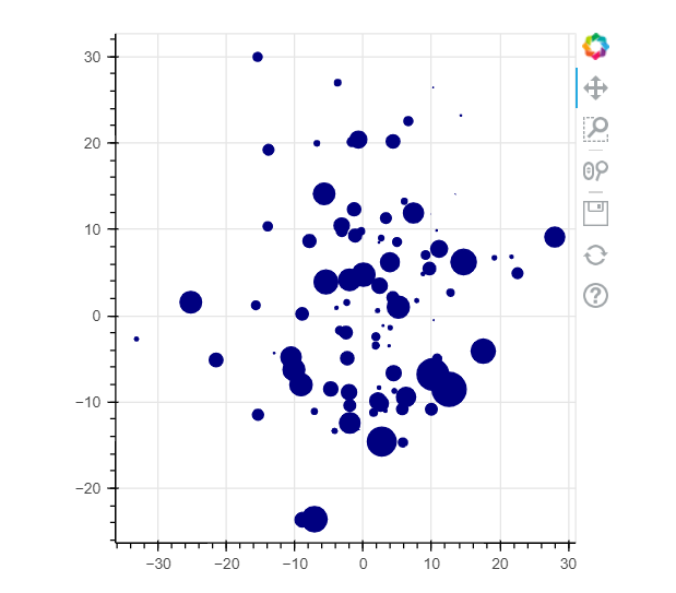
Summary
All of these libraries have their pros and cons. The best match really depends on what you are currently working on. Our approach is usually the following. If Matplotlib provides all you need use it. This is because it has the best support across the frameworks and environments. Otherwise, go with the library that provides the tools that you need.
Further reading
Check the following great resources for further reading material.
- Data Visualization using Matplotlib – A Beginner’s Guide
- Visualization with Seaborn
- Data Visualization Using Seaborn for Beginners
- Interactive Data Visualization in Python With Bokeh
Repositories
- https://github.com/matplotlib/matplotlib
- https://github.com/mwaskom/seaborn
- https://github.com/plotly/plotly.py
- https://github.com/bokeh/bokeh
Books
- Data Visualization in Python with Pandas and Matplotlib
- Hands-on Matplotlib: Learn Plotting and Visualizations with Python 3
- Numerical Python: Scientific Computing and Data Science Applications with Numpy, SciPy and Matplotlib
- Data Visualization with Python for Beginners: Visualize Your Data using Pandas, Matplotlib and Seaborn (Machine Learning & Data Science for Beginners)
- Interactive Dashboards and Data Apps with Plotly and Dash: Harness the power of a fully fledged frontend web framework in Python
- Python Data Visualization Essentials Guide: Become a Data Visualization expert by building strong proficiency in Pandas, Matplotlib, Seaborn, Plotly, Numpy, and Bokeh
- Hands-On Data Visualization with Bokeh: Interactive web plotting for Python using Bokeh