Introduction to Altair Visualization using Python

Altair is a declarative statistical visualization library for Python. Unlike imperative libraries where you explicitly state steps to create a visualization, Altair allows you to declare links between data columns to visual properties, and the library takes care of the rest. It's built on a solid foundation of theorems about visualization, making it not only effective but also a joy to use.
In this article, we will explore the basics of Altair, how to create various types of charts, and how to harness its power for effective data visualization.
Why Altair?
There are numerous libraries available for visualization in Python, such as Matplotlib, Seaborn, and Plotly. So, why consider Altair?
- Simplicity: Altair provides a simple syntax to create a wide variety of visualizations.
- Declarative Nature: Instead of focusing on the process, you focus on the result. You specify what you want, not how to achieve it.
- Vega-Lite: Altair visualizations are built upon Vega-Lite, a visualization grammar. This ensures that the visualizations follow best practices and are highly expressive.
What does declarative nature mean?
"Declarative nature" refers to a style of programming or specifying tasks where you express what you want to achieve without having to describe how to achieve it. It contrasts with the "imperative" approach, where you provide a sequence of steps to achieve a desired outcome.
Let's break this down with a simple analogy:
Imperative: Think of it as giving turn-by-turn driving directions. "Start at point A. Drive 3 miles north. Turn right at the gas station. Drive 2 miles east. Your destination is on the left."
Declarative: This is like specifying the destination address in a GPS. You just say, "I want to go to 123 Main St." The system figures out the best route.
In the context of Altair (or other visualization libraries with a declarative approach):
Declarative: You specify the data and indicate you want, for instance, a scatter plot of x against y, colored by z. Altair figures out how to render that visualization for you.
Imperative: You would have to define each point, set its position, color it according to a scale, manage the axes, etc.
The benefits of a declarative approach, especially in data visualization, include:
- Simplicity: By focusing on what you want (the end result) rather than the process to achieve it, you often write less, clearer code.
- Flexibility: The underlying system can optimize or change the "how" without the user needing to rewrite or even be aware of those changes.
- Consistency: The system handles the details, which can lead to more consistent results, especially when applied across multiple tasks.
Altair's design philosophy is rooted in its declarative nature, and this is evident in the way visualizations are created using the library. Here's how the declarative nature relates to Altair:
High-Level Specification: In Altair, you specify what you want in your visualization, not how to do it. For instance, when creating a scatter plot, you don't instruct Altair on how to draw each point. Instead, you declare that you want a point mark and map data columns to visual properties, like the x-axis, y-axis, and color. Altair takes care of the rest.
Vega-Lite Backend: Altair produces JSON structures that adhere to the Vega-Lite schema, a high-level grammar of interactive graphics. The Vega-Lite engine then interprets this JSON to render the visualization. This separation means the user only needs to focus on the high-level design of the chart, while the underlying Vega-Lite system handles the rendering details.
Consistent and Reproducible Visualizations: Because you're specifying what you want rather than how to achieve it, there's less room for unintended variation between visualizations. Whether you're creating a bar chart, line chart, or scatter plot, the approach is consistently about mapping data to visual properties.
Simplified Interaction and Layering: Adding interactivity (like zooming or panning) or layering multiple charts is straightforward in Altair. You're not dealing with event handlers or manually overlaying graphics. Instead, you declaratively specify the interaction or layers you want.
Compact and Readable Code: Altair visualizations are often concise and easily understandable. By focusing on the end result, Altair code tends to be more readable and maintainable than an equivalent imperative approach.
Altair's declarative approach allows users to think more about their data and the story they want to tell, rather than getting bogged down in the minutiae of rendering graphics. This makes it a powerful tool for data exploration and storytelling, especially for those who might not have a deep background in graphics programming.
Getting Started
Before diving into examples, ensure you have Altair installed. You can install it via pip:
!pip install altair
A Simple Example
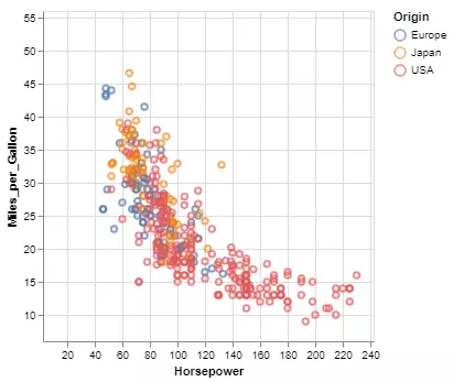
Let's start with a simple scatter plot. Suppose we have a dataset of cars with their miles-per-gallon (mpg) and horsepower. We can visualize the relationship between these two variables using a scatter plot.
!pip install vega_dataset
import altair as alt
from vega_datasets import data

# Load dataset
cars = data.cars()

# Create a scatter plot
chart = alt.Chart(cars).mark_point().encode(
    x='Horsepower',
    y='Miles_per_Gallon',
    color='Origin'
)

chart
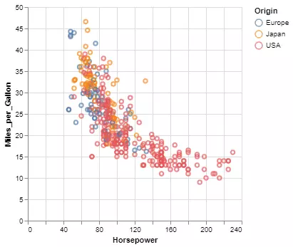
In the above code, we've used the vega_datasets package, which provides a set of sample datasets for visualization. The mark_point() method indicates that we are interested in a scatter plot, and the encode() method maps the variables to the respective axes.
Basic Chart Types
Altair supports a variety of chart types. Here's a quick rundown:
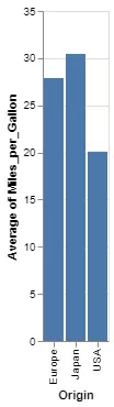
1. Bar Chart
bar_chart = alt.Chart(cars).mark_bar().encode(
    x='Origin',
    y='average(Miles_per_Gallon)'
)

bar_chart
2. Line Chart
Suppose we wish to see the trend of miles-per-gallon over the years.
line_chart = alt.Chart(cars).mark_line().encode(
    x='Year:T',
    y='average(Miles_per_Gallon)'
)

line_chart

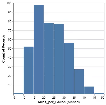
3. Histogram:
Visualize the distribution of a variable, say, miles-per-gallon.
histogram = alt.Chart(cars).mark_bar().encode(
    x=alt.X('Miles_per_Gallon', bin=True),
    y='count()'
)

histogram
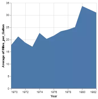
4. Area Chart:
Similar to a line chart but with the area under the line filled in.
area_chart = alt.Chart(cars).mark_area().encode(
    x='Year:T',
    y='average(Miles_per_Gallon)'
)

area_chart
Other types of supported charts
Altair is known for its wide range of visualization capabilities. Here's a short list of other essential chart types supported by Altair:
Text Charts: Allow labeling specific points or areas on a chart, useful for annotations or highlighting specific data points.
Box Plots: Used to depict the distribution of data based on five summary statistics: minimum, first quartile, median, third quartile, and maximum. It helps in understanding the spread and skewness of the data and spotting outliers.
Heatmaps: Represent data in a grid format with colors indicating values. They are effective for visualizing dense data matrices or correlation tables.
Error Bars: Graphical representation of data variability. They indicate the error or uncertainty in a measurement.
Strip Plots: Similar to scatter plots, but specifically used for plotting data points along one axis. They're useful when one of the variables is categorical.
Trellis (Facet) Plots: Allow multiple, related plots to be displayed side by side, each showing a different subset of the data.
Layered Plots: Combine multiple plots into one visualization by overlaying them. For instance, you can have a bar chart with a line chart on top to represent a secondary variable.
Geo-Visualizations: Handle geographical data. Examples include choropleth maps (regions shaded in proportion to a measurement) and point maps (individual data points represented on a geographical layout).
Radar (Spider) Charts: Depict multivariate data in the form of a two-dimensional chart, with three or more quantitative axes starting from the same point.
Donut and Pie Charts: Represent categorical data in the form of segments of a circle, where the arc length of each segment represents the quantity of the data.
Stacked Bar and Area Charts: Allow part-to-whole relationships and the composition of data to be easily visualized. Each segment of the bar or area chart represents a particular category, stacked on top of each other.
Violin Plots: Combine aspects of box plots and density plots to provide a visualization of the distribution of the data, its probability density, and its cumulative distribution.
Streamgraphs: A type of stacked area graph which is displaced around a central axis, resulting in a flowing, organic shape.
Step Charts: Similar to line charts, but they connect data points with vertical and horizontal lines, forming a step-like progression.
Circular Plots (e.g., Sunburst, Radial Trees): Represent hierarchical data structures. They're useful for showing layered information where one category can be broken down into several sub-categories in a circular format.
These are just a few examples of the plethora of visualizations Altair supports. The library's strength lies in its flexibility and its ability to combine and customize these plots as needed. You can further explore the Altair gallery for more examples and inspiration.
Interactivity
One of the impressive features of Altair is its built-in support for interactivity. Without much effort, you can add interactive features to your visualizations.
Let's make our scatter plot interactive:
interactive_chart = alt.Chart(cars).mark_point().encode(
    x='Horsepower',
    y='Miles_per_Gallon',
    color='Origin'
).interactive()

interactive_chart
By simply chaining the interactive() method to our chart, we've made it zoomable and pannable.
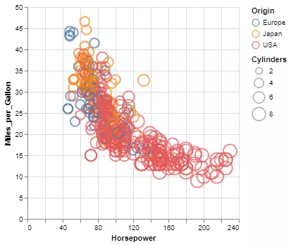
Customizations
Altair charts are highly customizable. From adjusting the size and color of points in a scatter plot to modifying the appearance of bars in a bar chart, the possibilities are vast.
For instance, to customize the size of points based on the number of cylinders in our scatter plot:
custom_chart = alt.Chart(cars).mark_point().encode(
    x='Horsepower',
    y='Miles_per_Gallon',
    color='Origin',
    size='Cylinders'
)

custom_chart
Conclusion
Altair offers an intuitive, declarative approach to data visualization in Python. Its simple syntax, combined with the power of Vega-Lite, makes it an excellent choice for both beginners and experts in data visualization.
For more in-depth details and to explore the vast capabilities of Altair, refer to the official Altair documentation.