How to use Correlation Matrices in Python

Correlation matrices are powerful tools for understanding the linear relationships between multiple variables in a dataset. They provide a compact way of representing how each variable is associated with every other variable. The primary use of a correlation matrix is to evaluate which pairs of variables have a high or low correlation, allowing for better feature selection and understanding of data relationships.
We will delve deep into correlation matrices, their intuition, and how to use and visualize them in Python. Specifically, we will:
- Understand the intuition behind correlation coefficients.
- Learn how to compute correlation matrices in Python.
- Visualize correlation matrices using heatmaps and other insightful visualizations.
- Discuss the significance and interpretation of the results.
Intuition Behind Correlation
Before diving into the computation and visualization, let's understand the intuition behind correlation.
Correlation measures the strength and direction of a linear relationship between two variables. The value of the correlation coefficient \( r \) ranges between -1 and 1:
- \( r = 1 \): Perfect positive linear relationship.
- \( r = 0 \): No linear relationship.
- \( r = -1 \): Perfect negative linear relationship.
In simpler terms, if one variable increases as the other also increases, they have a positive correlation. If one variable decreases as the other increases, they have a negative correlation. If there's no discernible pattern, the correlation is close to zero.
Computing Correlation Matrix in Python
Python provides a plethora of libraries to compute correlation matrices. The most popular one is pandas, which provides the corr() method for DataFrames.
Let's see how we can compute the correlation matrix of a sample dataset.
import pandas as pd

# Sample data
data = {
    'A': [1, 2, 3, 4, 5],
    'B': [5, 6, 7, 8, 9],
    'C': [9, 8, 7, 6, 5]
}

df = pd.DataFrame(data)

correlation_matrix = df.corr()
print(correlation_matrix)
In the above code, we first import the necessary library, then create a sample dataset. The corr() method of the DataFrame then computes the correlation matrix for us.
Now, let's move to the visualization part, which is crucial for intuitively understanding the relationships between variables.
If you are interested in how to work with correlation in NumPy, refer to our previous post.
Visualizing Correlation Matrices
Visualizations provide a much more intuitive understanding of the data than raw numbers. Heatmaps are one of the most popular ways to visualize correlation matrices.
Heatmaps using Seaborn
Seaborn is a Python data visualization library based on matplotlib. It provides a high-level interface for drawing attractive and informative statistical graphics.
To visualize our correlation matrix using a heatmap, we can use Seaborn's heatmap function.
Let's visualize the correlation matrix we computed earlier.
import seaborn as sns
import matplotlib.pyplot as plt

sns.heatmap(correlation_matrix, annot=True, cmap='coolwarm', center=0)
plt.show()
In the above code, the annot=True argument allows us to see the actual correlation values in the heatmap. The cmap argument defines the color palette (in this case, 'coolwarm'), and the center=0 argument ensures that values close to zero are neutral in color.
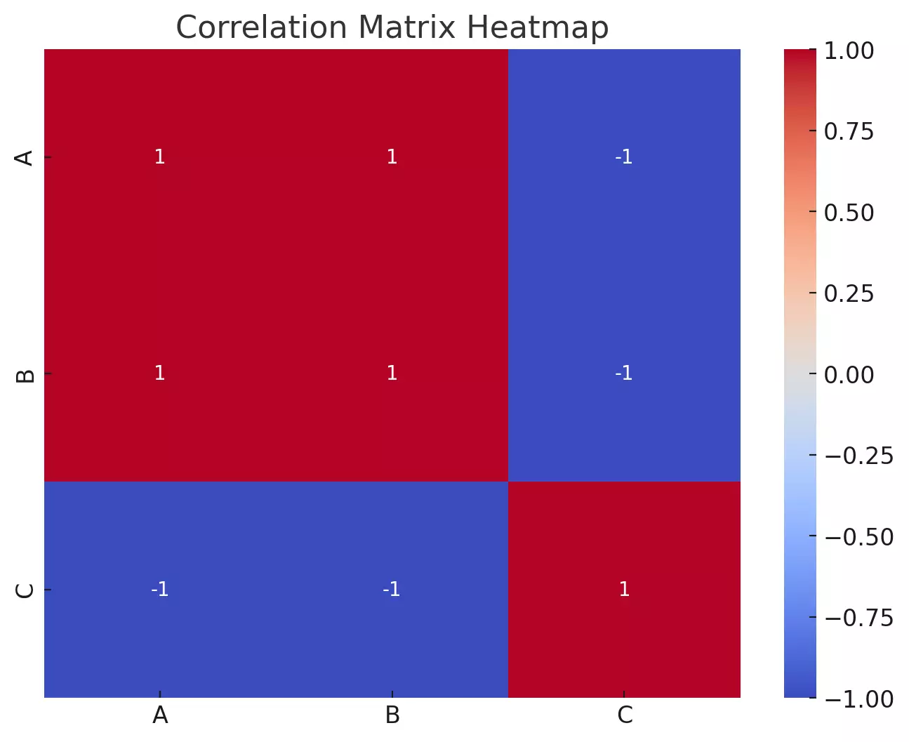
Here's the heatmap for our sample correlation matrix:
- Variables \( A \) and \( B \) have a perfect positive correlation of 1, as indicated by the dark blue square. This is expected since \( A \) and \( B \) increase together in our sample data.
- Variables \( A \) and \( C \) have a perfect negative correlation of -1, as seen from the dark red square. This is because as \( A \) increases, \( C \) decreases.
- Variables \( B \) and \( C \) also have a perfect negative correlation.
The diagonal, from the top left to the bottom right, will always have a value of 1 because any variable is perfectly positively correlated with itself.
This heatmap allows us to quickly gauge the relationships between variables. For larger datasets with many variables, such visualizations are especially beneficial, providing a snapshot of the relationships without having to sift through tables of numbers.
- Dark blue colors represent positive correlations.
- Dark red colors represent negative correlations.
- Colors closer to white or neutral represent correlations near zero.
This provides a quick and intuitive understanding of how variables are related. For instance, if two variables have a dark blue square between them, they are positively correlated.
Significance and Interpretation
While the correlation matrix and its visualization provide insights into the relationships between variables, it's essential to remember a few things:
- Correlation does not imply causation. Just because two variables are correlated does not mean one causes the other.
- Beware of spurious correlations. Sometimes, variables can appear correlated due to random chance or a lurking third variable.
- Consider the context. Understanding the domain and context of your data is crucial. A strong correlation between two variables might make sense in one context but be nonsensical in another.
Example using real-life data
Let's use a real-world dataset: the Iris dataset. The Iris dataset is a widely-used dataset in the machine learning community, introduced by the British biologist Ronald Fisher in 1936. It contains measurements for 150 iris flowers from three different species: setosa, versicolor, and virginica.
The dataset has the following features:
- Sepal length
- Sepal width
- Petal length
- Petal width
- Species (the target variable)
We'll compute the correlation matrix for the four measurement features and visualize it using a heatmap.
# Loading the Iris dataset from sklearn's datasets
from sklearn import datasets

# Load Iris dataset
data_iris = datasets.load_iris()
iris_df = pd.DataFrame(data_iris.data, columns=data_iris.feature_names)

# Compute the correlation matrix
iris_df_correlation = iris_df.corr()

# Plot heatmap
plt.figure(figsize=(10,7))
sns.heatmap(iris_df_correlation, annot=True, cmap='coolwarm', center=0)
plt.title("Correlation Matrix Heatmap of Iris Dataset")
plt.show()
- sepal length (cm) and petal length (cm) have a high positive correlation of approximately 0.870.87, which means that as the sepal length increases, the petal length also tends to increase.
- petal length (cm) and petal width (cm) show an even stronger positive correlation of approximately 0.960.96, indicating a very strong relationship between these two measurements.
- sepal width (cm) and petal length (cm), as well as sepal width (cm) and petal width (cm), have negative correlations, meaning as the sepal width increases, petal length and width tend to decrease.
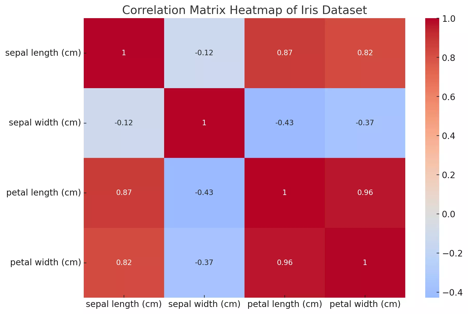
This visualization provides a clear understanding of the relationships between the various measurements of the iris flowers. Such insights can be valuable when performing tasks like feature selection in machine learning or understanding the relationships in the data for analysis purposes.
Conclusion
Correlation matrices are invaluable tools for understanding the relationships between variables in a dataset. By computing and visualizing these matrices, we can gain insights that might be difficult to discern from raw data alone.
Python, with libraries like pandas, seaborn, and matplotlib, provides powerful tools to compute and visualize these matrices, making the process seamless and intuitive.
As always, while correlation matrices provide valuable insights, it's crucial to interpret the results with caution, considering the context and understanding that correlation does not imply causation.
References: