Guide to Plotting Histograms with Seaborn

When it comes to data visualization, histograms are essential tools for understanding the distribution of a dataset. They enable us to see the underlying frequency distribution of continuous or categorical data, providing insight into the shape, spread, and central tendency of the data. In this guide, we will explore how to create and customize histograms using Seaborn, a popular data visualization library in Python.
Introduction to Histograms
A histogram is a graphical representation of the distribution of a dataset. It consists of bars where the height of each bar represents the frequency or probability of the occurrence of data within specific intervals, known as bins. The x-axis represents the value ranges (bins), and the y-axis represents the frequency or density.
Histograms are especially useful in statistical analysis as they reveal patterns, trends, and potential outliers in the data. Unlike a bar chart, which represents categorical data, histograms are used to visualize the distribution of continuous data.
Why Use Histograms?
Histograms are valuable because they:
- Reveal the Underlying Distribution: You can quickly see where values are concentrated, and identify patterns such as skewness or bimodality.
- Highlight Outliers: Unusual spikes or gaps may indicate data quality issues or exciting phenomena.
- Facilitate Comparisons: By overlaying histograms, you can compare different datasets or groups within a dataset.
Limitations and Considerations
While histograms are powerful, they come with some considerations:
- Choice of Bin Size: The appearance and interpretation of a histogram can change dramatically with the choice of bin size or bin count. Too many bins may over-complicate the plot, while too few may oversimplify the data.
- Not Suitable for Small Datasets: Histograms may not be informative for very small datasets, as the binning process might lead to a loss of information.
Getting Started with Seaborn
Seaborn is a Python data visualization library based on Matplotlib. It provides a high-level, more aesthetically pleasing interface for creating informative and attractive statistical graphics.
Installation
Before you can start plotting histograms with Seaborn, you need to have it installed. If you haven't already done so, you can install Seaborn via pip:
pip install seabornImporting Libraries
Next, you'll want to import Seaborn and Matplotlib to your Python script or notebook:
import seaborn as sns
import matplotlib.pyplot as plt
Plotting Basic Histograms
With Seaborn imported, you can now plot a basic histogram using the sns.histplot() function. This function provides an easy way to visualize the distribution of data, as described in the official documentation.
Plotting a basic histogram using Seaborn involves the following steps:
- Prepare the Data: You need to have a dataset that you want to analyze. This can be a list, array, or Pandas Series of numerical data.
- Use
sns.histplot()Function: This is the main function in Seaborn to create a histogram. You pass your data to this function. - Display the Plot: Using Matplotlib's
plt.show(), you can display the plot.
Here's a simple example that puts these steps together:
import numpy as np

data = np.random.randn(1000)  # Generate 1000 random numbers
sns.histplot(data)           # Plot the histogram
plt.show()                   # Display the plot
Understanding the Output
The resulting histogram will consist of bars, where:
- The x-axis represents the continuous range of values (or bins), into which the data points are grouped.
- The y-axis represents the frequency or count of the number of data points in each bin.
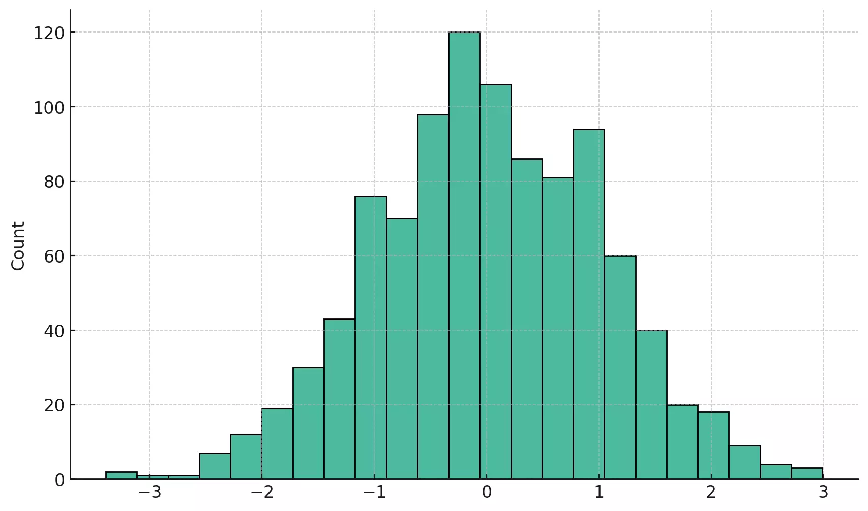
The above histogram provides a visual summary of the distribution of 1000 randomly generated numbers. The x-axis represents the value ranges, divided into bins, while the y-axis shows how many data points fall into each bin.
Plotting basic histograms with Seaborn is straightforward, yet provides a profound insight into the distribution of a dataset. The sns.histplot() function is a powerful tool that takes care of many underlying details, enabling you to focus on the interpretation and analysis of the data.
Customizing Histograms with Seaborn
Histograms are often customized to suit the specific requirements of an analysis or to enhance their visual appeal. Seaborn provides a range of options that allow you to customize various aspects of a histogram. Whether you want to change the color scheme, add labels, adjust the bin size, or add additional statistical representations, Seaborn has the tools you need.
Below, we will explore some of the common ways to customize histograms using Seaborn and test the code to visualize the customizations.
Adding Labels and Title
Proper labeling is an essential aspect of any data visualization. Including labels for the axes and a title for the plot helps to clarify what the histogram represents.
plt.xlabel(): Adds a label to the x-axis.plt.ylabel(): Adds a label to the y-axis.plt.title(): Adds a title to the plot.
Example:
sns.histplot(data)
plt.xlabel('Value')
plt.ylabel('Frequency')
plt.title('Histogram of Random Data')
plt.show()
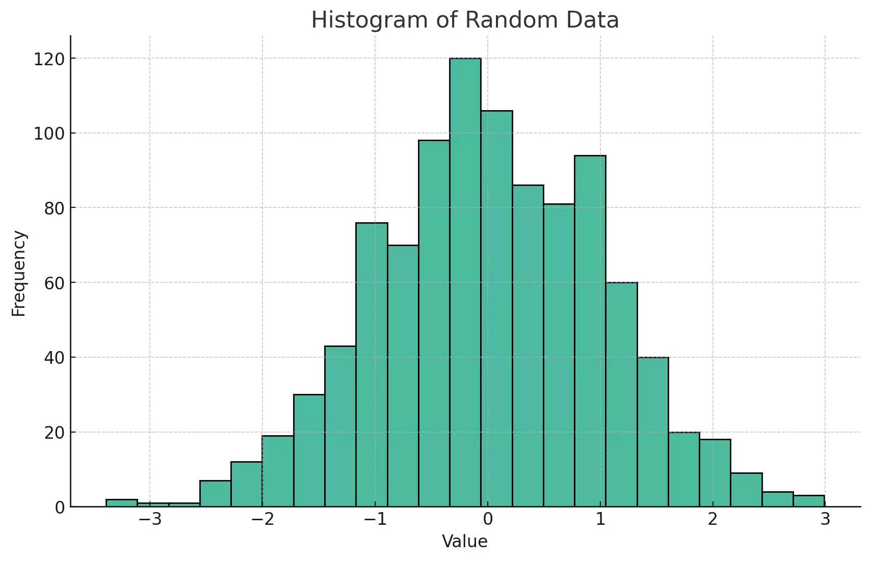
The above plot is now enhanced with labels for both axes and a title, providing a more apparent context for the data being visualized.
Changing the Bin Size
The choice of bin size can significantly impact the appearance and interpretability of a histogram. You can control the number of bins using the bins parameter or set a specific bin width using the binwidth parameter.
bins: Sets the number of bins.binwidth: Sets the width of the bins.
Example:
# Using specific number of bins
sns.histplot(data, bins=20)
plt.show()

# Using specific bin width
sns.histplot(data, binwidth=0.5)
plt.show()
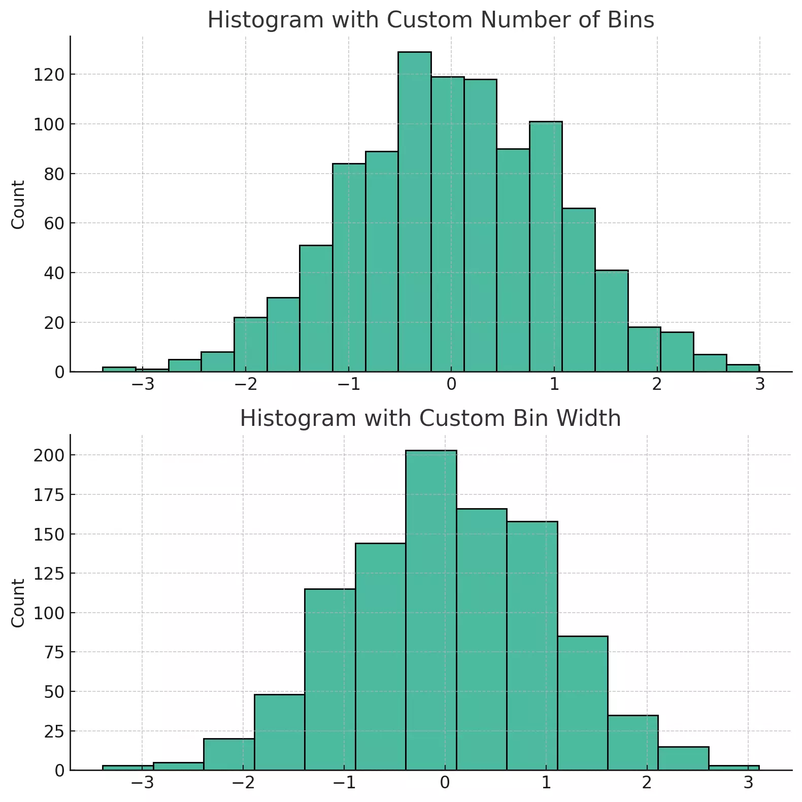
The two histograms above illustrate how different choices of bin sizes can change the appearance of the plot. The first plot uses a specific number of bins (20), while the second plot sets a specific bin width (0.5). Both parameters can be adjusted to achieve the desired granularity.
Changing Colors
Altering the color of the bars can enhance the visual appeal of a plot or align it with specific themes or branding. The color parameter allows you to set the color of the bars.
Example:
sns.histplot(data, color='skyblue')
plt.show()
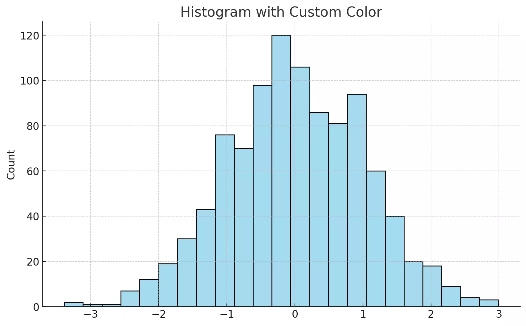
The histogram above uses a sky-blue color for the bars, showcasing how a simple color change can enhance the visual appeal of the plot.
Multiple Customizations Together
You can combine multiple customizations to create a plot that precisely fits your needs. Labels, titles, bin sizes, and colors can all be adjusted simultaneously.
Example:
sns.histplot(data, bins=15, color='purple')
plt.xlabel('Value')
plt.ylabel('Frequency')
plt.title('Customized Histogram')
plt.show()
Customizing histograms allows you to create plots that are both visually appealing and tailored to your specific analytical needs. Seaborn's flexibility in customization ensures that you can represent your data in a way that aligns with your objectives and audience.
The functions and parameters discussed here are just the starting point. Seaborn offers many more options, including the ability to add KDE plots, adjust plot styles, and much more. The official Seaborn documentation provides detailed information on all the available customizations for histograms.
Plotting Multiple Histograms with Seaborn
Visualizing and comparing multiple datasets or groups within a dataset is a common task in data analysis. Multiple histograms allow you to overlay or side-by-side compare the distributions of different groups. Whether you're comparing different experimental conditions, demographic groups, or time periods, Seaborn's ability to plot multiple histograms makes these comparisons intuitive and insightful.
We'll explore how to plot multiple histograms using Seaborn, including overlaid and side-by-side comparisons, and how to customize these plots.
Overlaid Histograms
Overlaid histograms allow you to plot multiple distributions on the same axis, providing a direct comparison.
Example:
You can plot multiple histograms by calling the sns.histplot() function multiple times before displaying the plot:
data1 = np.random.randn(1000)
data2 = np.random.randn(1000) * 2

sns.histplot(data1, color='blue', label='Data 1')
sns.histplot(data2, color='red', label='Data 2')
plt.legend()
plt.show()
This will create two histograms overlaid on the same plot, allowing for a clear visual comparison between the two datasets.
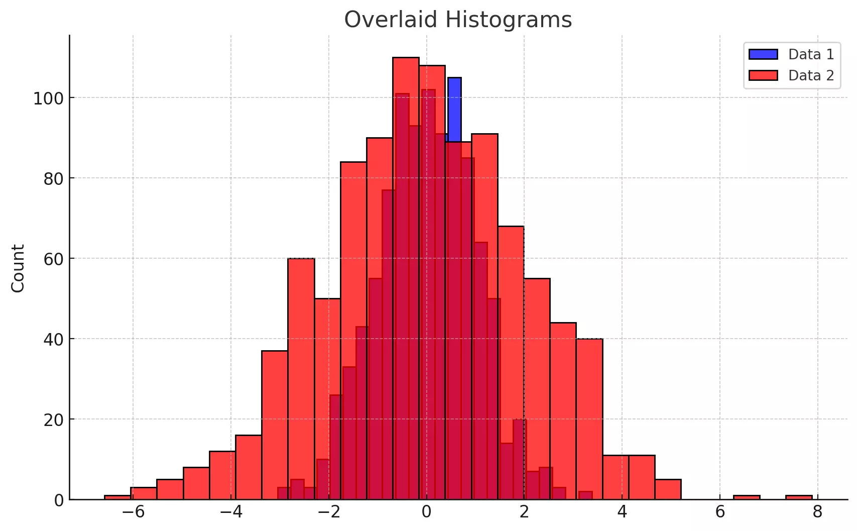
The plot above displays two overlaid histograms in different colors, allowing for a clear comparison between the two datasets. The legend helps identify which histogram corresponds to each dataset.
Side-by-Side Histograms
Another way to compare multiple distributions is to plot the histograms side by side. This can be achieved using the hue parameter in Seaborn, which separates the data based on a categorical variable.
Example:
Assuming you have a Pandas DataFrame with two columns, value and category, you can create side-by-side histograms as follows:
# Generating random data
data1 = np.random.randn(1000)
data2 = np.random.randn(1000)

# Creating a DataFrame with two categories
df = pd.DataFrame({
    'value': np.concatenate([data1, data2]),
    'category': ['Data 1'] * 1000 + ['Data 2'] * 1000
})

# Plotting side-by-side histograms
sns.histplot(data=df_side_by_side, x='value', hue='category', multiple='dodge')
plt.title('Side-by-Side Histograms')
plt.show()
This will create side-by-side histograms, with each category represented by a separate color.
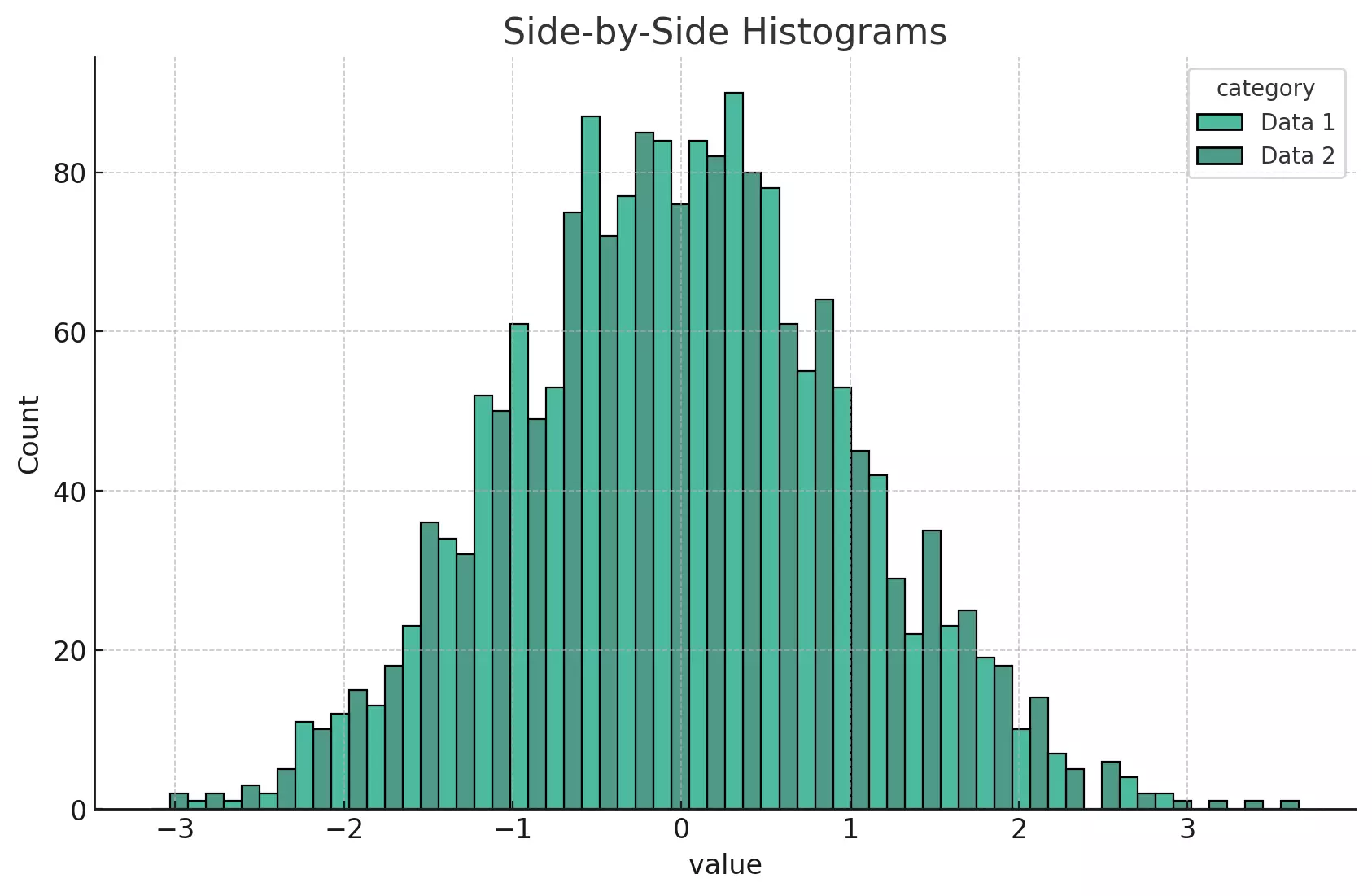
The above plot shows two histograms displayed side-by-side within each bin for the categories "Data 1" and "Data 2". This view allows for a clear comparison of the counts in each bin between the two categories.
By examining the heights of the bars within each bin, we can observe differences in the distributions of these two datasets. The different colors represent different categories of data, as specified by the hue parameter.
This side-by-side layout provides a clear comparison of the distributions, helping us understand how these two sets of data differ.
Kernel Density Estimation (KDE)
Kernel Density Estimation (KDE) is a non-parametric method for estimating the probability density function of a random variable. It provides a smooth estimate of the distribution, overcoming some of the limitations of histograms, such as sensitivity to bin size. In simple terms, KDE can be thought of as "smoothing" the distribution and providing a continuous curve.
Seaborn makes it easy to add a KDE to your histograms or to create standalone KDE plots using the kdeplot() function.
Adding KDE to Histograms
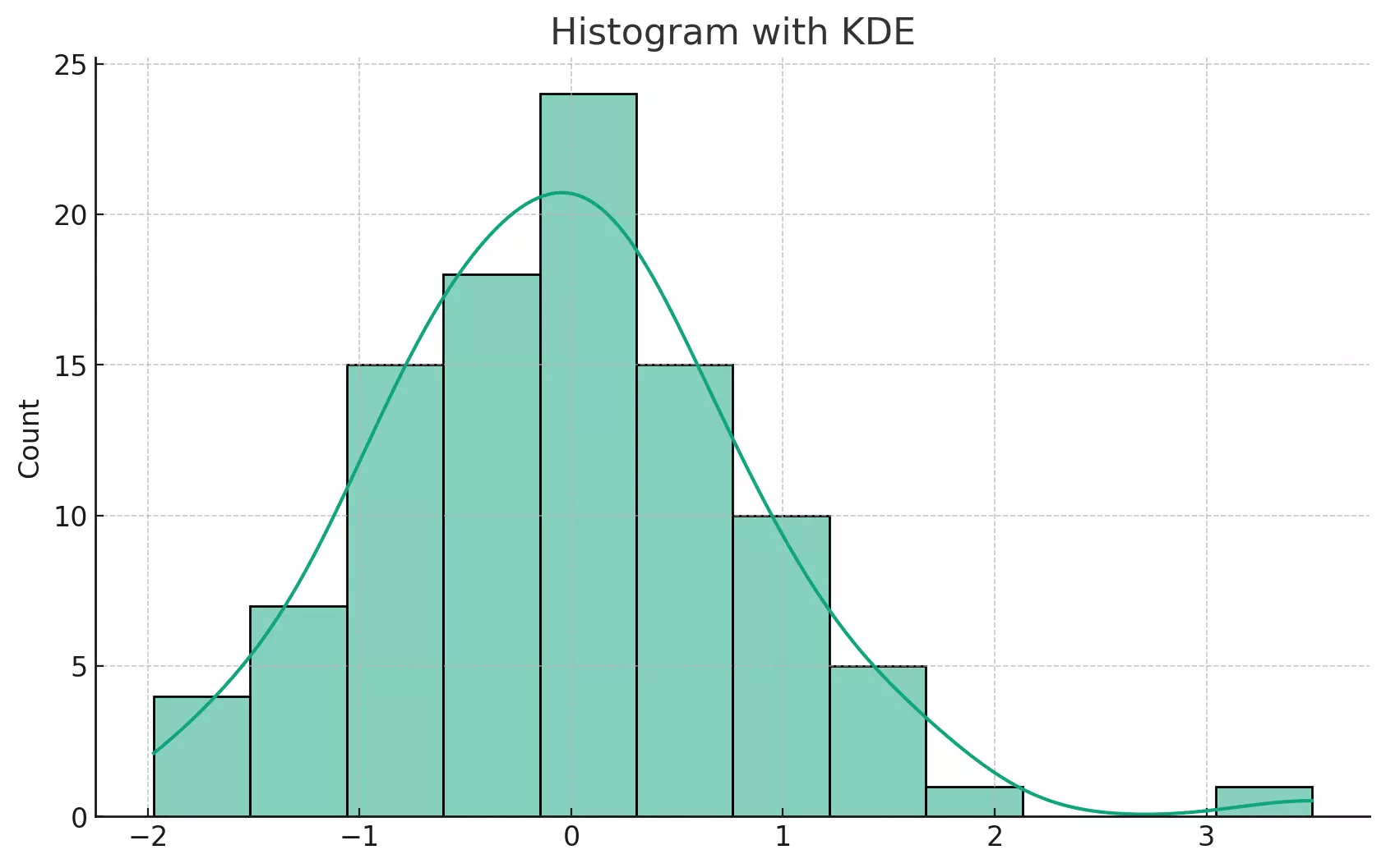
You can add a KDE line to your histogram using the kde=True argument in the histplot() function. This gives you both the empirical distribution (the histogram) and the smooth density estimate (the KDE).
Here is an example:
import seaborn as sns
import numpy as np
import matplotlib.pyplot as plt

# Generate some random data
data = np.random.randn(100)

# Create a histogram with a KDE
sns.histplot(data, kde=True)
plt.show()
This will create a histogram of the data and overlay a KDE plot on top of it.
It seems like there was a reset in the code execution state. Let's re-import the necessary libraries and re-run the code.
The plot above shows a histogram of randomly generated data with a Kernel Density Estimate (KDE) overlaid. The KDE is the smooth line that runs over the bars of the histogram. It provides a visual estimate of the probability density function, which can be useful for understanding the overall shape and spread of the data.
KDE Plot Alone
You can also plot a KDE without the histogram using the sns.kdeplot() function in Seaborn. This provides a smooth curve that represents the distribution of your data.
Here is an example:
# Generate some random data
data = np.random.randn(100)

# Create a KDE plot
sns.kdeplot(data)
plt.show()
This code will create a KDE plot without the histogram.
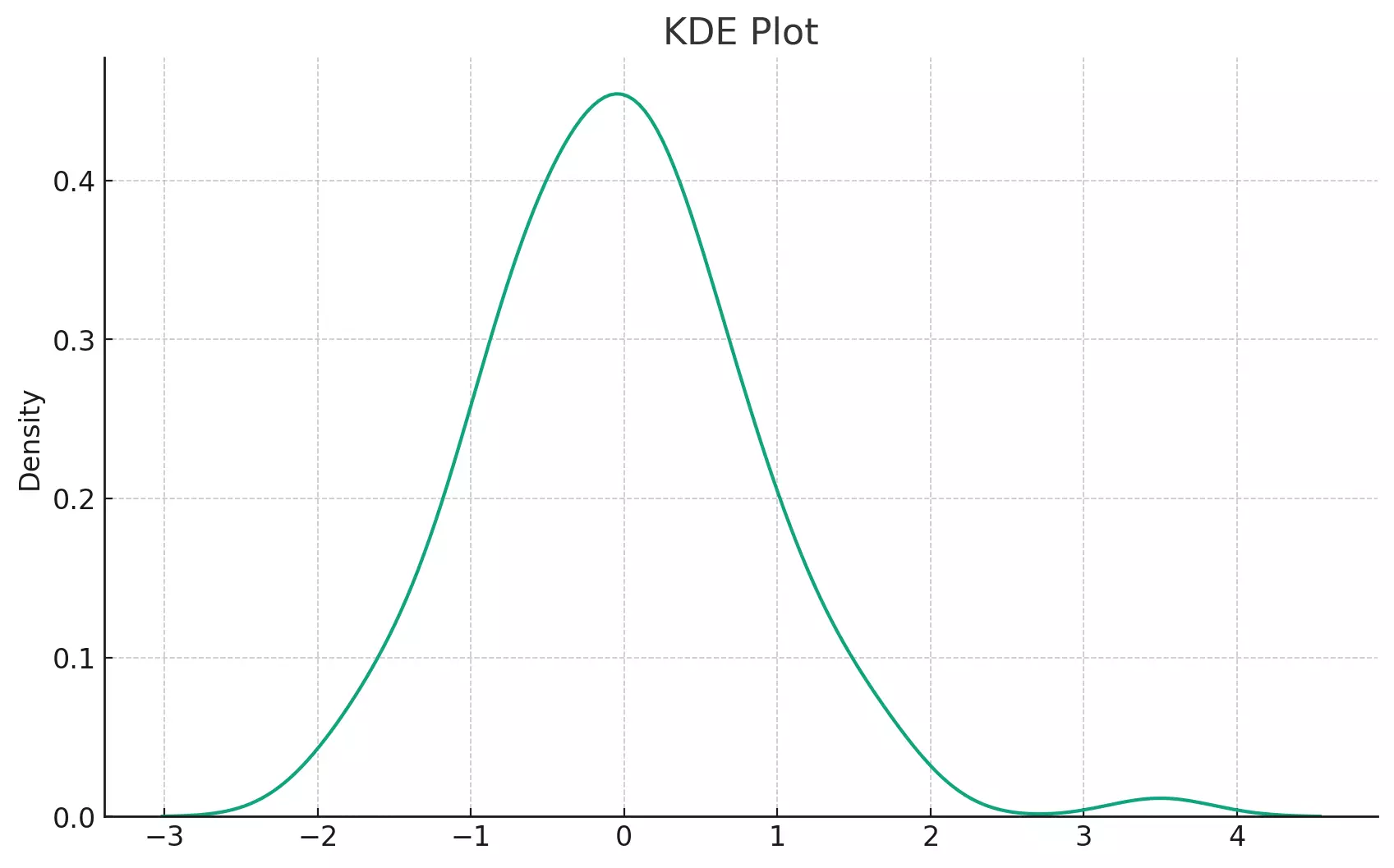
The plot above shows a KDE of the randomly generated data. Without the bars of a histogram, the KDE plot provides a smooth and continuous representation of the data's distribution. It's a great tool for visualizing the overall shape of the data, especially when a histogram might be too granular or noisy.
Adjusting Bandwidth in KDE
The bandwidth (bw_adjust parameter in Seaborn) is a crucial parameter in a KDE plot. It determines the width of the kernel and hence, the smoothness of the KDE. A larger bandwidth leads to a smoother KDE, while a smaller bandwidth can capture more details but might also capture noise.
Here's how you can adjust the bandwidth:
# Generate some random data
data = np.random.randn(100)

# Create a KDE plot with a larger bandwidth
sns.kdeplot(data, bw_adjust=2)
plt.show()

# Create a KDE plot with a smaller bandwidth
sns.kdeplot(data, bw_adjust=0.5)
plt.show()
This code will create two KDE plots with different bandwidths.
For more detailed information about KDE plots in Seaborn, you can refer to the official Seaborn documentation on kdeplot().
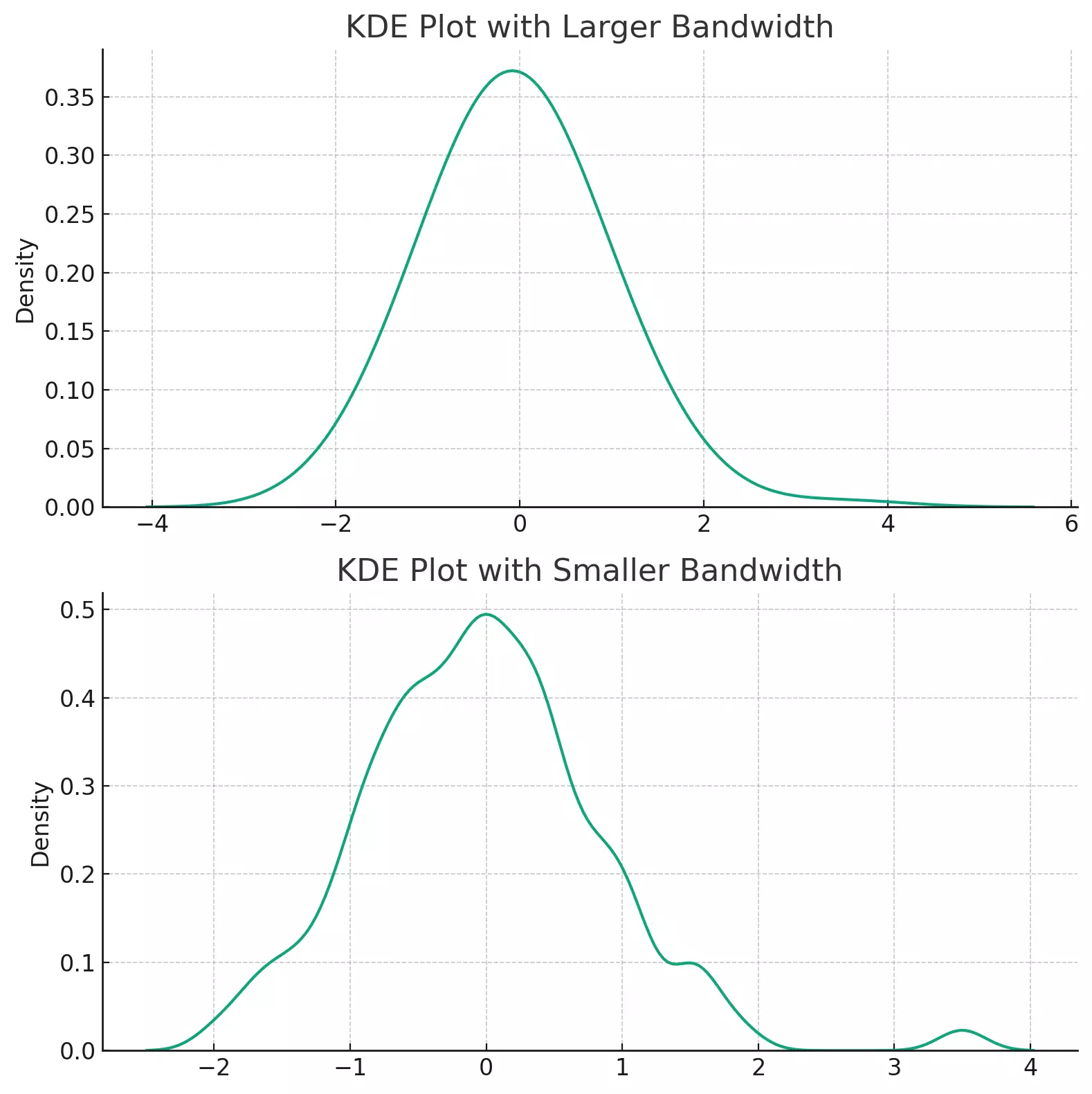
The two plots above illustrate the impact of bandwidth on KDE plots.
The first plot uses a larger bandwidth, which results in a smoother KDE. This is useful when you want to see the overall shape of the distribution and are less interested in the finer details.
The second plot uses a smaller bandwidth, which allows the KDE to capture more details. However, it also captures more noise and may make the distribution appear more jagged.
The choice of bandwidth is a balance between bias (over-smoothing) and variance (under-smoothing). A good bandwidth captures the important features of the data without including too much noise.
In conclusion, Kernel Density Estimation (KDE) is a useful tool for visualizing the distribution of data. It provides a smooth, continuous estimate of the distribution, overcoming the granularity and potential noise of histograms. Seaborn makes it easy to create and customize KDE plots, whether standalone or in conjunction with histograms. For more details, you can refer to the official Seaborn documentation on kdeplot().
Conclusion
Histograms are invaluable tools in data analysis, and Seaborn offers a powerful and flexible way to create them. This guide has covered the basics of plotting, customizing, and interpreting histograms using Seaborn, referencing the official Seaborn documentation where applicable.
With Seaborn's easy-to-use interface and extensive customization options, you can create informative and visually appealing histograms to suit any data analysis need. Whether you're a student, researcher, or data professional, mastering Seaborn will empower you to convey complex data in a clear and compelling way.